Posted: June 3rd, 2010 | Author: Brandon Walkin | Filed under: Uncategorized | Comments Off on Xcode UI Improvements
Xcode is a fantastic development environment for developing Mac, iPhone, and iPad applications. But it has some areas for improvement. In this post, I’ll explore some improvements to how documentation and autocompletion is integrated into the development workflow and how Xcode could provide specialized interfaces for working with system frameworks.
There are two primary use cases for accessing documentation. One is immersing yourself in guides to learn the theory behind part of a framework. The other is quick API reference. The latter is where the current documentation workflow in Xcode (the documentation window and Quick Help window) has lots of room to improve. Here are the main problems with the current interaction model:
- Documentation takes you out of your programming flow. Once you need to access documentation, you have to open a heavyweight window that’s far from the code you’re writing, and remove yourself from the context of writing code.
- Developers need to manually move information from the documentation window to their code and often vice versa. If I’m working with a particular class in code and need documentation on it, I occasionally have to tell the documentation window about that class. When I find the particular bit of information I’m looking for, be it a method name, argument, etc, I have to manually move that bit of information to my code. This makes for a fairly inefficient workflow.
- For methods that can only accept a small set of arguments, an additional disclosure interaction is required to view the set of arguments. If I want to set a view controller’s modal presentation style, for instance, I need to click a hyperlink from the documentation on modal presentation style that takes me to another webpage in order to see the various styles I can set.
- The API documentation doesn’t make use of images in the cases they’d be appropriate. Paragraphs of text are written to describe what can often be more effectively conveyed using images.
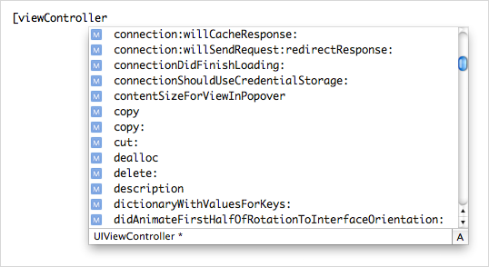
- Developers have to access documentation because the autocompletion list often isn’t helpful. Take the autocompletion list for an instance of UIViewController, for example. Every method that can possibly be understood by a standard view controller instance is listed there – even delegate methods for unrelated classes.
My Proposal
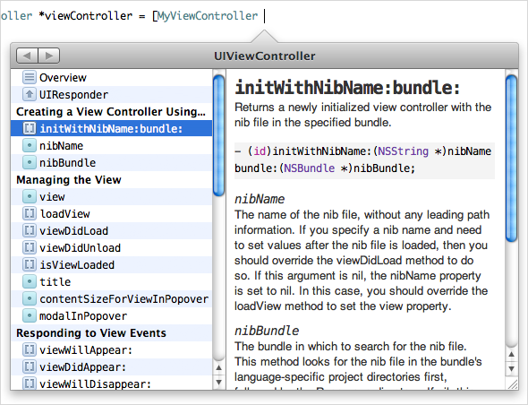
I propose that API documentation is combined with autocompletion. Anywhere in your code where it would make sense to show an autocompletion window, we show this window instead. Rather than show a set of seemingly random methods, we instead show the methods the particular class responds to, with a mechanism to view methods and documentation for the superclass. You can use the cursor or the arrow keys to read the documentation for particular methods, and when you hit Return, the method is added for you and syntax surrounding the method is adjusted appropriately. For instance, if you begin the statement with a call on a class object and you choose an instance method in the documentation window, an “alloc” will be added accordingly.
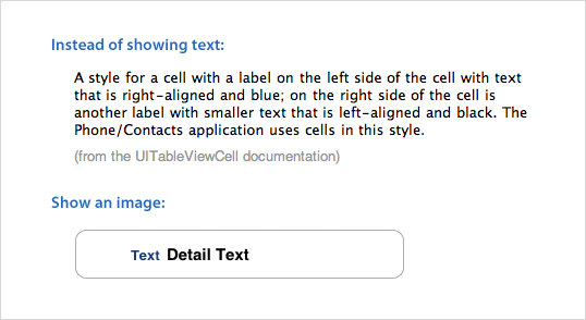
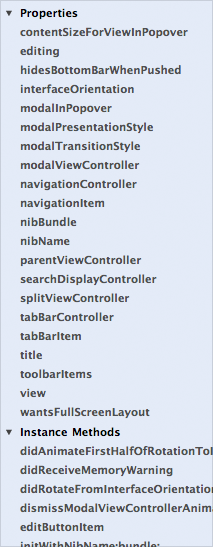
The list on the left consists of methods and properties the class implements, grouped by type of development task. Simply scanning through this list gives you a good understanding of what the class does and how to interact with it.
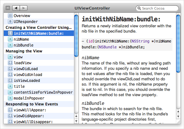
Compare to the system documentation that groups functionality into properties, instance methods, and class methods (which aren’t helpful groupings for finding functionality in a class) and sorts items in those sections alphabetically:
Sidenote: Ingredients deserves credit for being the first documentation viewer I’ve seen to group methods by task in the source list. Task grouping is one of the main features that makes it such a pleasure to use compared to Xcode’s viewer and other third-party documentation viewers.
Dragging the window away from the code it’s inspecting will un-anchor it and let you use the window in more of a back-and-forth reference fashion (much like how Xcode’s documentation window is used today). The window loses its arrow and a close button and search field appear. The search field will let you search for any symbol in Cocoa or Cocoa Touch (depending on what your project is targeting). Search results appear in a menu below the search field, so you keep your context as you search.
In some cases, we can do even better than autocompleting method and property names. The window gets even more useful in the case of setting a variable that only has a small set of arguments it accepts.
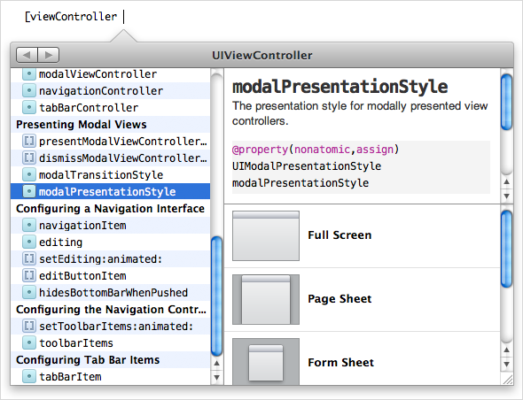
A third pane will appear below the documentation with a list of possible arguments, showing images when appropriate. You can arrow over to the argument list, hit Return, and the method name, along with the argument will be entered into your code.
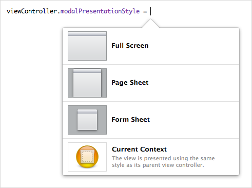
Here are the current set of steps for setting a view controller’s modal presentation style, if you aren’t aware of the name of the property:
- Start typing your statement with the name of the view controller.
- Open the documentation window.
- Search for UIViewController.
- Click modalPresentationStyle under the tasks section of the webpage.
- Copy “modalPresentationStyle” into your code.
- Click UIModalPresentationStyle to get the list of styles.
- Find the desired style and copy it into your code.
The steps for accomplishing the same task with this interface:
- Start typing your statement with the name of the view controller.
- Hit the keyboard shortcut for showing the autocompletion window.
- Select modalPresentationStyle in the source list.
- Select the desired style and press Return. The entire statement will be entered in your code.
If the developer already knows about the method or property name, Xcode can still be helpful by providing a focused, rich interface for choosing a value.
Other Contexts
The contextual disclosure type of interaction is also useful in other contexts. For example, when I want to assign a graphic in my project to a new variable, my interaction with Xcode generally follows this pattern:
- Start typing out the instantiation statement.
- Scroll around in the Groups & Files list looking for where the particular image is nested.
- Click the image to see a preview of it to make sure it’s the image I want.
- Copy the image’s filename.
- Press the back button to go back to the code I started at.
- Paste the filename and add the required syntax around it.
What if while you were in the flow of instantiating an image variable, Xcode showed you a menu with filenames and thumbnails of all the images being bundled with your target?
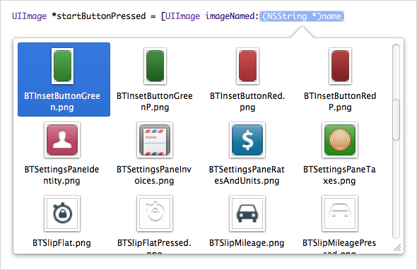
Now the steps to instantiate an image variable are:
- Start typing out the instantiation statement.
- Hit a keyboard shortcut to show the thumbnail menu.
- Choose your desired image and hit return. The rest of the syntax will be entered for you.
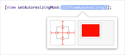
Another example is setting a view’s autoresizing mask. An autoresizing mask specifies how a view resizes as its parent view resizes. Interface Builder has a great interface for configuring one of these. You can click on a view’s edges to specify which edges should be anchored to the edges of the superview. You can also click inside the view to specify whether it should resize vertically, horizontally, both, or neither.
As you click around adjusting those settings, there’s an animation of a view getting resized as its parent view resizes, giving you instant feedback showing you how your changes will affect resizing of the view.
The interaction for setting an autoresizing mask in Xcode is second-class in comparison. Regardless of if you use property syntax or message passing syntax, the autocompletion window won’t give you anything useful. You have to go into a documentation window outside of your flow, search for autoresizingMask, click to see the values that can be passed in, know that you have to bitwise OR these together, know the syntax for bitwise OR, and construct a long statement with values copied from the documentation window.
Like Interface Builder, Xcode should know what an autoresizing mask is and show you a usable interface for setting one.
In this post, I’ve explored just a few use cases and improvements. But there’s nearly endless potential for an Xcode that truly understands the frameworks being used and provides effective interfaces for interacting with them.
Posted: September 21st, 2009 | Author: Brandon Walkin | Filed under: Design | Comments Off on iTunes Visual Redesign
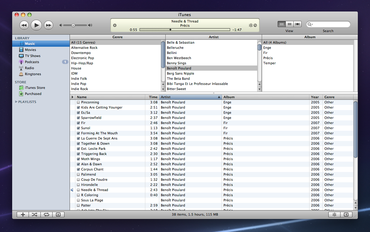
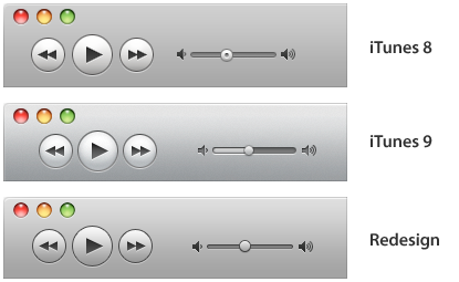
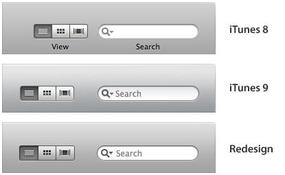
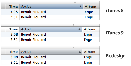
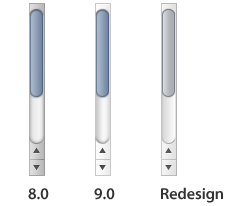
iTunes 9 was released a couple weeks ago with a significant number of user interface changes. It’s always interesting to look at the direction that’s taken with the iTunes UI because it’s often used as a testing bed for future iterations of the Mac OS X user interface. I thought it would be fun to spend a weekend thinking about the iTunes visual design and giving it a minor refresh.
The Design
For comparison:


Toolbar
Display

Table Headers
Scrollbars
Checkboxes

I’m closing the comments so I don’t have to sort through spam. If you’ve got feedback, feel free to hit me up on Twitter.
Posted: August 10th, 2009 | Author: Brandon Walkin | Filed under: Design | Comments Off on Managing UI Complexity
Interface complexity is an issue every designer wrestles with when designing a reasonably sophisticated application. A complex interface can reduce user effectiveness, increase the learning curve of the application, and cause users to feel intimidated and overwhelmed.
I’ve spent the past year redesigning a particularly complex application with my primary focus being on reducing complexity. In this article, I’ll go over some of the issues surrounding complexity and techniques that can be used to manage it.
Progressive Disclosure
Progressive disclosure is the most popular means of managing complexity. The idea is that clutter and cognitive overhead can be reduced by hiding less frequently used elements behind some avenue of accessing those elements, like a mouse click or a keyboard shortcut. It requires that the designer accurately determine which elements are frequently and infrequently used and to what degree.
Quite a bit of care needs to be put into the progressive disclosure hierarchy and the mechanisms used for disclosure. Poorly considered use of progressive disclosure can achieve the opposite of the intended effect by making the interface even more complex. As an example, Microsoft Windows has been trending towards removing the menu bar from individual windows and instead packing each function into the main interface (often using pull down menus), which has some issues. I’ll go over a few of them:
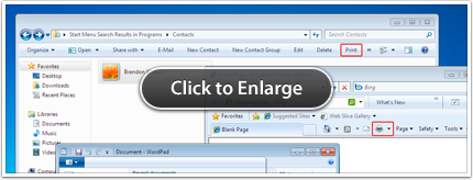
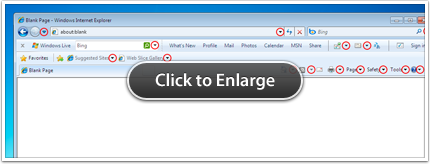
- There are inconsistent ways of accessing common functionality. The Print function, for example, is in different locations in both the application’s interface and the progressive disclosure hierarchy. The Print controls in Internet Explorer, Contacts (Windows Explorer), and WordPad are highlighted in the screenshot below, to illustrate this. Competing first-party Mac applications (Safari, Address Book, and TextEdit, respectively) have the Print function available in a consistent location – the last item in the File menu. A user who learns how to print in one of those Mac applications won’t have to hunt to find the Print function in other applications. It’s a “learn once, use everywhere” model.
- There’s a tendency to overwhelm the user with progressive disclosure points. The default Internet Explorer interface (with Windows Live installed) has a total of 17 pull down buttons – highlighted below. Further, all of these progressive disclosure controls require screen real estate. As more screen real estate is occupied by administrative actions, less is dedicated to displaying the actual content of the application (which, in this case, are webpages).
Contextual Actions
This is a form of progressive disclosure where contextually appropriate controls are exposed on a particular object. The most common implementation are contextual menus, activated on the Mac by a right-click or a control-click. While contextual menus are a consistent and useful way of revealing contextual actions on objects, they’re hard to discover, which makes them inappropriate for workflow-critical actions that necessitate greater weight in the interface.
The standard way to give these actions greater weight is to integrate them in your interface by providing the set of contextual controls in front of or near each object. Complexity is increased substantially, because the set of controls is repeated for every object on screen. We can get rid of most of this complexity by using a different progressive disclosure technique. Controls can be displayed on a single object if the object is selected, the object has focus, or when the mouse is over the object. This solves the complexity issue since there’s only one set of contextual controls being shown at a particular time, but it’s not without its downsides. Consider whether this sort of technique is appropriate for your interface before deciding one way or the other.
Alignment & Visual Hierarchy
Aligning elements in a user interface to a simple, consistent grid, will go great lengths in reducing the appearance of complexity. The use of strict alignment and a thoughtfully laid out grid can turn an interface from chaotic and overwhelming to harmonious and appealing.
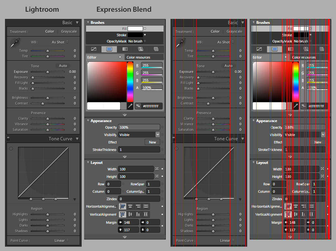
Some compelling examples are the inspectors in Microsoft Expression Blend and Adobe Lightroom. While a host of factors are responsible for the Expression Blend inspector looking considerably more complex than the Lightroom inspector, the rough horizontal alignment is certainly a primary one. The horizontal alignment lines have been drawn in red to illustrate the differences.
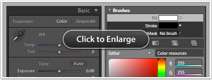
The examples shown above also demonstrate the effectiveness of the techniques used in each interface to indicate hierarchy. The Lightroom inspector has very strong visual distinctions between section headings and their contents. Headings are prominent. Set in large type with generous padding and a relatively high contrast foreground-background color combination, sections, headings, and the relationships between them are immediately clear.
Visual Noise & Contrast
The amount of visual noise in an interface has a great deal of impact on the perceived complexity of the interface. And contrast plays an important role with respect to visual noise. Using lower contrast UI elements reduces visual noise which will often reduce the effective complexity of the interface, as you’ll see in the next couple of examples.
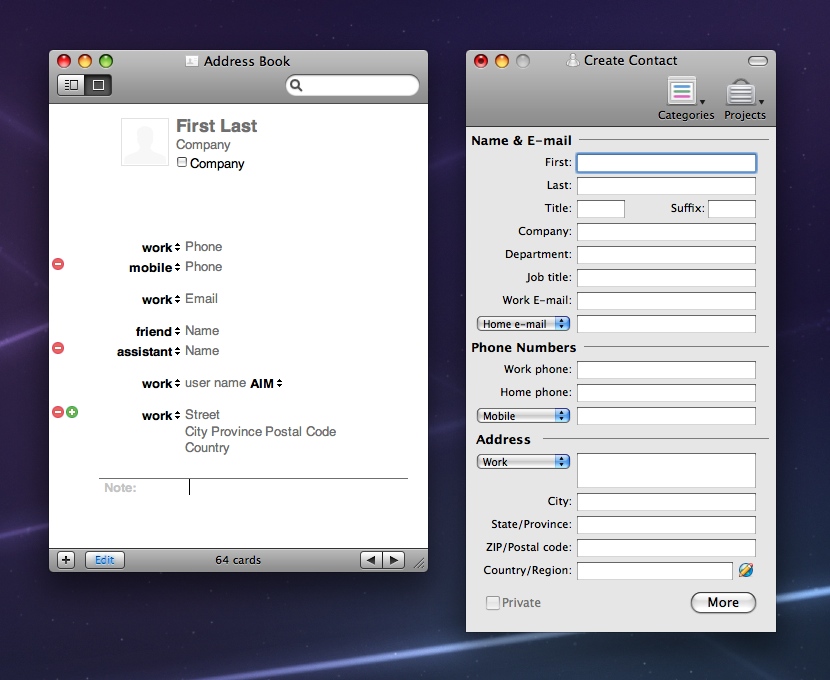
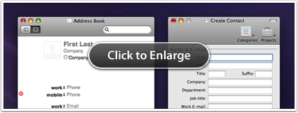
The Address Book UI eschews fields with relatively high contrast borders in favour of fields with borders that are only visible if the field has focus. This causes the fields to blend in with the rest of the interface. The Create Contact window in Entourage 2008 uses the standard window background color and standard text field styling which contributes to the interface looking more complex than the Address Book interface.
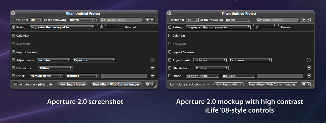
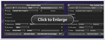
As another example, I’ve taken the Filter window in Aperture 2.0 and mocked up what it would look like with the transparent controls from iLife ’08 (and parts of iLife ’09) with high contrast edges instead of the relatively low contrast controls that it shipped with. The UI I’ve mocked up looks notably more complex than the shipping interface because of the higher contrast controls. Simply adjusting the styling of your controls can have a considerable impact on complexity.
Use of Icons
Interfaces widely regarded as complex with high learning curves are often characterized by an abundance of icons or glyphs that lack descriptive labels. When a user opens an application for the first time with an interface covered in label-less glyphs, it can be quite daunting. Every icon with a non-obvious meaning will have to be learned for the user to feel any sort of mastery over the application.
This is a difficult problem to solve. There often isn’t room for a label to sit next to an icon, and in many cases there is cost involved in replacing an icon with a label (mainly, users will not be able to quickly scan the interface for the icon). Deciding when to use an icon, a label, or both, is an art all in itself.
Nevertheless, here are some tips for those faced with this issue:
- Revamp your icons so they convey their meaning more effectively. Improve metaphors, adjust sizes, colors, etc.
- Use grouping to imply meaning. Grouping related icons together can often provide sufficient context to imply their function.
- Using progressive disclosure, place less often used icon-only buttons in a pull down menu with both icons and their labels. A nice benefit of this is that the user will learn the meaning of each icon when they use the pull down menu, and if the menu is designed to be used early on in a user’s experience with the application, you can get away with using those icons without labels in other places in the app (since the user will have already learned their meanings at that point).
Mental Models
A great way to reduce effective complexity is to align the conceptual model expressed by your interface with your user’s mental model as closely as possible. A poorly thought out model contributes to complexity by adding a significant amount of cognitive work that your users have to perform to learn your interface.
The recurrence UI in Windows Calendar, for instance, reflects the developer’s model of the task rather than the user’s model. Take a look at the second set of radio options in this screenshot:
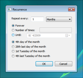
- What’s the “28th last day of the month”?
- What’s the “4th last Tuesday of the month”?
- How long did you spend trying to work that out?
These options feel complex because the language used and functionality that’s represented doesn’t reflect your understanding of repeating events. Combat this issue by researching how your users conceptualize relevant tasks so your models are intuitive. You can read more about mental models in the HIG.
Use your Judgement
Finally, use your own judgement. There are costs associated with nearly every technique I’ve listed here. Carefully consider each technique in the context of your interface and determine which are most appropriate for your application and how best to apply them.