Introducing BWToolkit
Posted: November 13th, 2008 | Author: Brandon Walkin | Filed under: Releases | Comments Off on Introducing BWToolkitUpdate: BWToolkit now has its own website.
BWToolkit is a BSD licensed plugin for Interface Builder 3 that contains commonly used UI elements and other useful objects. Using these objects is as simple as dragging them from the library to your canvas or document window.
When I first heard about the plugin architecture in IB 3, I saw a huge potential for improving the developer user experience and lowering the barrier to entry for developers who are new to Cocoa. I hope to have accomplished that with this plugin. Read on for details regarding the items in BWToolkit and screencasts showing how they work. Be sure to read the release notes if you’re interested in downloading the plugin. It has installation instructions and known issues that users of this plugin should be aware of.
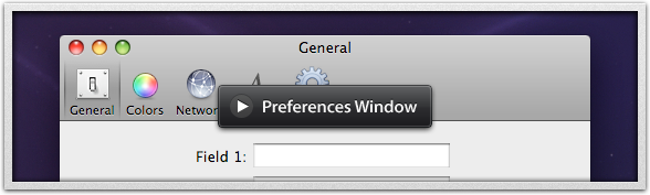
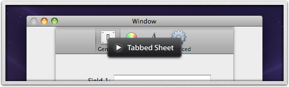
“No Code” Preferences Windows and Tabbed Sheets
With the Selectable Toolbar item in this plugin, you’ll be able to create preferences windows and tabbed sheets without writing a line of code. Using BWToolkit to create a preferences window or a tabbed sheet is radically simpler than conventional means. You don’t have to write a controller class or fiddle with plists and multiple nib/xib files. It’s drag and drop. Watch the videos below to see it in action.
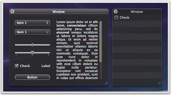
Transparent Controls
BWToolkit contains a suite of controls for transparent windows (or HUD windows). Provided controls include a button, pop-up button, check box, slider, text field, text view, table view, and a check box cell for a table view. If you find yourself needing a much wider array of controls than the ones available here, a standard panel may be more appropriate for your particular interface.
Button Bars
The plugin includes an anchored button bar, anchored buttons, and unanchored buttons. An anchored button bar is one that is placed directly below a view (in other words, anchored to that view). Anchored button bars often appear at the bottom left of windows below source lists (like in Mail.app), below a table view with padding below the bar (like the Network pref pane), or run all the way across the bottom of the window (like in AppZapper). The anchored button bar library item handles all three of these modes.
Unanchored buttons are usually placed below a table view with a bit of padding separating the view from the buttons. They’re often configured to have a plus button beside a minus button. The unanchored buttons are similar to “Gradient Buttons” in Interface Builder, but tweaked to aesthetically replicate the +/- buttons in System Preferences. For instance, when a button is disabled, only the glyph dims, so the group of buttons remain a visually cohesive unit.
Using the anchored button bar and the gradient split view included in the plugin, you can easily create a Mail.app style interface. When an anchored button bar is dropped in a vertical split view, the split view is automatically configured to resize when the user drags the resize handle on the button bar. It’s also configured to keep the source list the same width while the window is resized – the standard split view behavior is to resize all of its subviews. Lastly, the left most view is constrained within a minimum and maximum width (which is configurable in the button bar inspector).

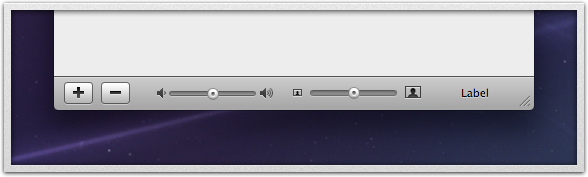
Bottom Bars
With this plugin, you’ll be able to add a bottom bar to a window and it will appear on your canvas. This makes sizing and placement of controls on or around the bottom bar a trivial exercise. There are four bottom bars to choose from: mini size, small size, regular size, and one for sheets.
There are also some controls for bottom bars included in the plugin. You’ll find plus and minus glyphs for regular size Round Textured buttons, a text field with an inset (or etched) appearance, and a textured slider. The textured slider comes pre-configured with the two most popular indicators in Mac apps: speaker and photo. If you opt to use them, you’ll find that the click actions for the two indicators are conveniently already hooked up to the slider.
And More
There are a few other items in the plugin that haven’t been listed yet or shown in a screencast: split views with adjustable divider colors, Fonts and Colors toolbar items from iWork ’08, and a fancy gradient token field.
If you have any questions or comments, feel free to email me or ping me on Twitter.
Â